Updates: March 2026
It's been a minute, hasn't it. In fact it has been checks notes 10 months?! Oh dear, well. Better late than never I suppose. If you're reading this directly on the website (and you should, imo), you'll see that things look quite different!
I've been meaning to touch up my website's design for, uh, most of last year to be honest but I haven't been able to get to it until a few weeks ago. So here it is. It's more of a reskin rather than a redesign but it feels fresher, lighter and tidier in ways I like so I'm pretty happy with it.
I've stuck to the excellent Atkinson Hyperlegible Next1 as a body font and switched the headings from Merriweather to Pangrampangram's Right Serif, I think they look quite neat.
I've made the website overall feel a bit more "professional". Not that I intend to write super serious stuff or anything but I eventually want to make I made https://erambert.me redirect to this website and to avoid maintaining two websites with a very similar purpose2.
Little details
I've had fun with some details in the design so now I'm just gonna show them off.
I'm using the shit out of CSS variables custom properties, meaning that all the colors in the theme are derived from 3 base colors, which means I can do stuff like this3:
And the color system means that making a dark mode involved changing a few colors and it looked great right away! Huge thanks to Tulip for helping me with these
Hover states for links are always a struggle for me, so I decided to stop worrying about it and going whole hog with it and making them very obvious:
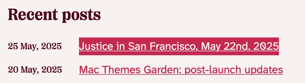
I wanted to have some fancy/flashy touches in the redesign, so I opted for this progressive blur effect in the sticky header on compatible browsers, I think it looks cute. Kudos to kennethnym because I wouldn't have bothered to figure it out myself, I think.
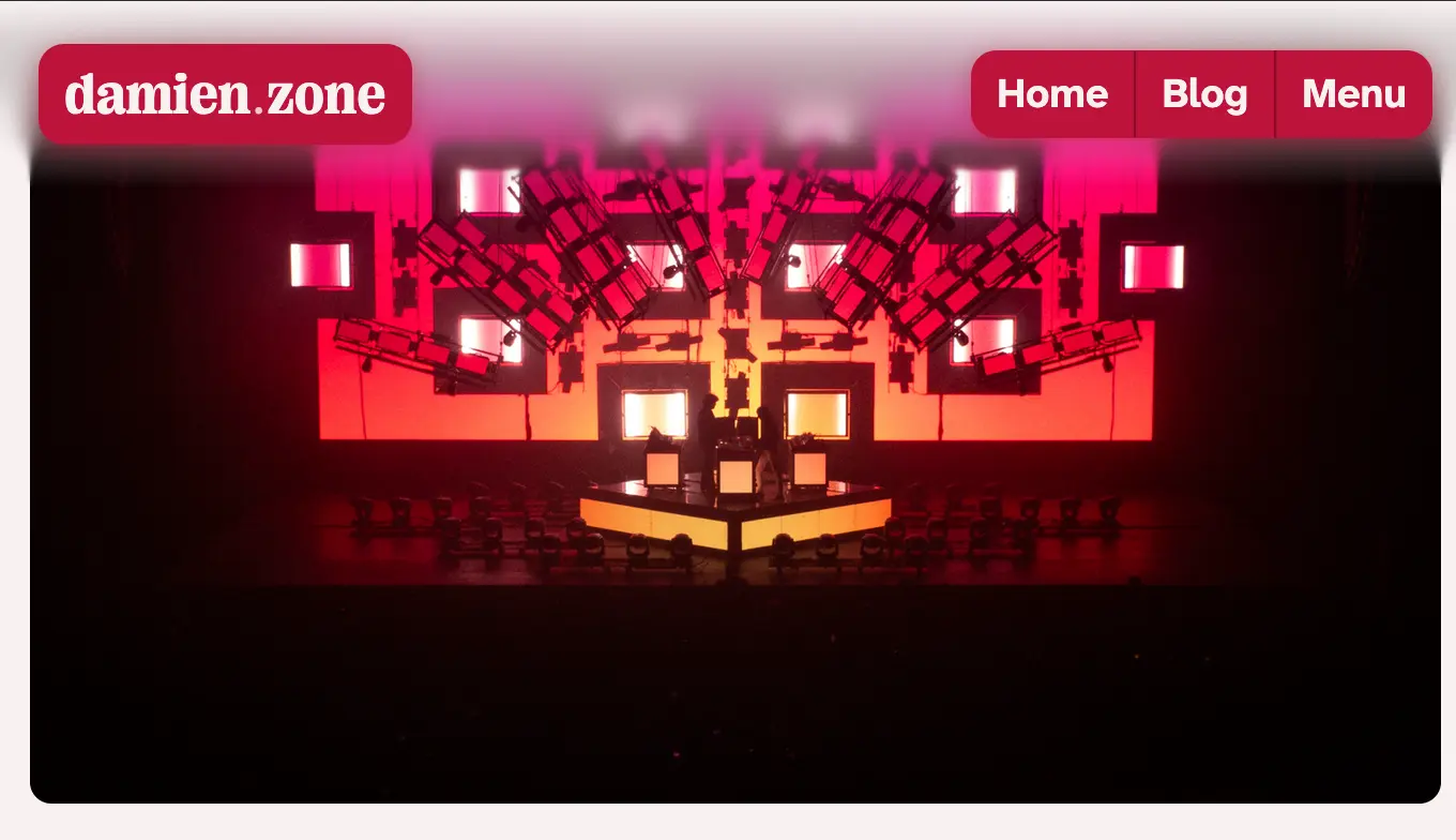
While on the topic of blurs, you know what's better than a colored shadow? A shadow that matches the image's colors. It's barely noticeable but I know it's there and it makes me happy
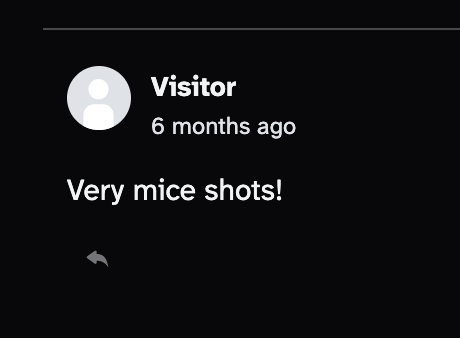
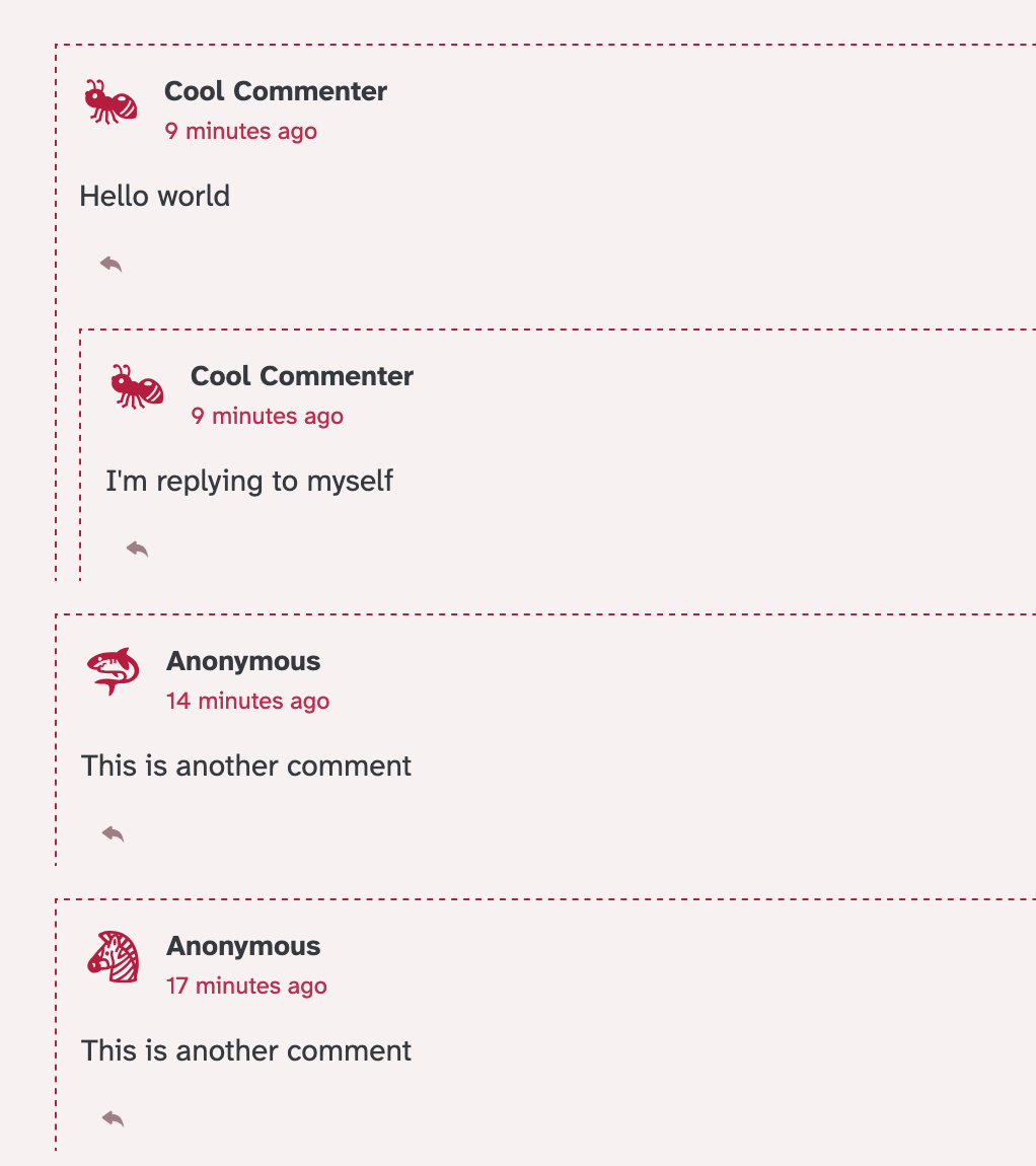
One thing I noticed when working on this redesign was how I really did not like the default Comentario avatar for anonymous comments. It does the job but it felt really jarring in my opinion:
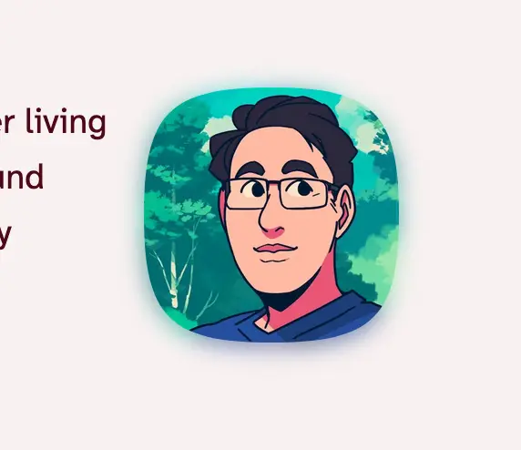
So I tried to come up with something, and I didn't want to just replace the default avatar with something else so I thought "could I somehow make something more unique and (more importantly) cuter?".
So I did! I will make a whole article about it because I don't want to derail this post too much but here's how it looks. It looks random but isn't really (more on that in the future post) and retains the same "random" avatar if an anonymous commenter reuses the same name.4
That's it ✨ I want to post more on this website this year, I swear I will (at least try to) stick to that this time around.
Footnotes
-
#eggbug forever ↩
-
I am, however, not gonna even think about migrating shit like email away from that domain. ↩
-
I would have made a video but A) this is funnier and B) this weighs nothing5 ↩
-
In case you're wondering, these are emoji taken from Noto Emoji (monochrome) ↩
-
Unfortunately styling the color input in CSS is not possible consistently yet and I am not bothering to write a custom color input ↩